Your Coaching Website is Not a Brochure — It's Your Admission Engine
- Why Coaching Websites Fail to Convert
- First Impression Decides in 5 Seconds
- Why Mobile Design Decides Admissions
- Course Pages That Drive Real Enquiries
- Trust Signals Parents Always Look For
- Website Mistakes That Kill Enquiries
- How the Right Website Grows Admissions
Request a Quote
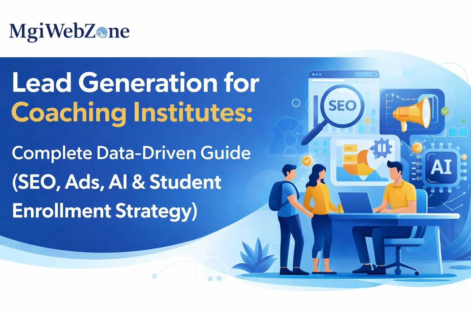
Website Design for Coaching Institutes and Education Institutes in India — The Complete Guide (2026 Edition)

How to Build a Website That Ranks on Google, Earns Student Trust, and Fills Your Batches
Your coaching has been running for years. The faculty is strong. The results are real. Former students speak well of you. And yet — every month — students who are actively searching for exactly what you offer end up at a competitor’s door.
Not because the competitor teaches better. Because their website showed up first. And when the student arrived, the website answered their questions before yours did.
This is the situation most coaching institute owners in India face right now. And the uncomfortable truth is this: in 2026, your website is not just an online brochure. It is your admission counsellor, your first impression, and your most important staff member — one that works 24 hours a day, seven days a week, even when your office is closed and your phone is off.
A student searching for UPSC optional coaching at 11pm on a Tuesday does not wait for you to open the next morning. They open three websites, spend forty seconds on each, make a judgment, and WhatsApp the one that made them feel confident. If your website is not that one, the enquiry goes elsewhere.
This guide is for every coaching institute owner — whether you run UPSC coaching, NEET preparation, CA Foundation classes, SSC coaching, a computer training centre, or a Class 10–12 tuition centre. The principles are the same across all of them. What changes is what “trust” looks like in your specific segment. We will cover both.
Table of Contents
How Students and Parents Find and Judge You Online
How Students Search for Coaching Institutes Online — Step by Step
Most coaching owners believe they lose students because of price or location. In reality, they lose them much earlier — on their own website, before a single conversation happens.
Here is the exact journey a student takes before they pick up the phone and call you.
1) Step one: they open Google on their mobile and type a question. Not a keyword — a question. “Best UPSC optional coaching in Delhi for working professionals.” “Which is the best CA Foundation coaching near me?” “Computer training institute in Patna with placement.” The search is specific. It reflects exactly where they are in their decision.
2) Step two: they scan the first three or four results. They read the page title and the two lines of description below it. They are making an instant judgment about which page is worth clicking. If your title is generic and your description says nothing useful, they do not click. Simple as that.
3) Step three: they land on your website. This is the moment everything is decided. They spend approximately six to eight seconds forming an impression. Can they tell what you offer? Can they see who teaches? Can they find a way to contact you without hunting for it? If any of these three fail, they press the back button.
4) Step four: they visit two or three more websites. They are comparing. Not just what you offer — how confident you make them feel. Which website answers their questions most clearly? Which one feels like it was built for them?
5) Step five: they WhatsApp or call the institute whose website made them feel most sure. That institute gets the enquiry. The others do not.
And here is the part that most coaching owners miss: the student never told you they visited. They left quietly. You have no record of them. And you have no idea how many of them leave your website every single day without enquiring.
This is the search journey in 2026. Your website is the critical point in this entire chain. Everything before it is about being found. Everything after it is about converting. The website is where both happen — or both fail.
How Students and Parents Evaluate Coaching Institutes Online Before Deciding
Once a student lands on your website, they are checking six things. Not consciously. But they are checking.
1) The first thing: Is it clear what this institute teaches? Not a long paragraph about your mission. A clear, specific statement. “Public Administration Optional coaching for UPSC Mains” or “CA Foundation and Intermediate coaching in Pune.”
2) The second thing: Who teaches here? They want a face, a name, a credential. Not a stock photo of a smiling person in a suit. The actual faculty member, with their qualification and a brief line about their background.
3) The third thing: Has this worked for others? Past results. Actual numbers. AIR 23 in CSE 2025 for a UPSC coaching. 94% pass rate in CA Foundation November 2025 attempt. Six students placed at TCS and Infosys last batch for a computer training centre. Specific proof, not vague claims.
4) The fourth thing: What exactly will I get? Batch schedule, fee range, what is included, how many tests, what format. Students do not call to ask basic questions if the website answers them. They call when they are already half-convinced.
5) The fifth thing: How do I take the next step? Is there a WhatsApp button? A simple enquiry form? A call number visible without scrolling? If reaching you requires effort, they move on.
6) The sixth thing — and this one is subtle: Does this website feel like the institute I imagined it to be? Does the design, the language, the photos, the results — do they match the reputation I was told about?
Now here is the honest question: How many of these six things does your website answer without the student having to call you? If the answer is fewer than four, you are losing enquiries every single day. Not because you lack students. Because your website is not doing its job.
For CBSE tuition centres and Class 10–12 coaching, note one important difference: the decision-maker is often the parent, not the student. A parent searching for “best coaching for Class 12 Science in Dwarka” is evaluating differently. They want teacher credentials, board result history, individual attention policy, and operating hours. The website must speak to them — not just to the student sitting next to them.
Psychology Behind High-Converting Coaching Websites
Here is something that most coaching owners find uncomfortable when they first hear it: students decide to enquire emotionally, and justify that decision logically. Design is not decoration. It is psychology.
The first five seconds on your homepage are not read. They are felt. Does this feel credible? Does this feel serious? Does this feel like a place where someone like me would succeed? If the answer is yes — they stay and read. If the answer is no — they leave. And they cannot tell you exactly why. It just “did not feel right.”
Think about it this way — two coaching institutes. Same subject. Same city. One website is cluttered, with seven rotating banners, four pop-ups, heavy music playing automatically, and a contact form buried at the bottom. The other is clean: institute name, what they teach, one line about their results, and a visible WhatsApp button. Both may have equally strong faculty. But the second one gets the enquiry. Because it felt like a place that knew what it was doing.
In our experience working with coaching institutes across India, the websites that convert best are never the most visually impressive. They are the clearest. Clarity converts. Clutter kills.
How Colours, Layout and Design Influence Student and Parent Decisions
You do not need a design degree to understand this. Some practical observations that make an immediate difference.
Deep navy and white signals authority and seriousness — right for UPSC, CA, GATE coaching. Bright orange and yellow signals energy and accessibility — right for SSC coaching, Class 10 tuition. Muted green and grey signals calm and focus — right for NEET, JEE, medical coaching. None of these are rules. They are signals. And signals either match or clash with the expectation the student brings to your website.
Layout matters even more than colour. A student should never have to decide where to look. The homepage should direct their eye — from the headline, to the key credential, to the next step. If their eye wanders and they have to choose between eight different things to click, they freeze. And frozen visitors do not enquire.
The most important design rule for a coaching website: every page should have one primary action it wants the visitor to take. One. Not three. Not five. One.
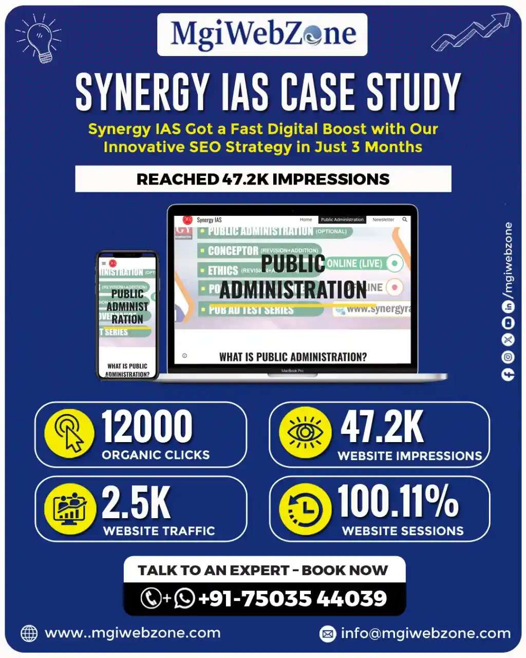
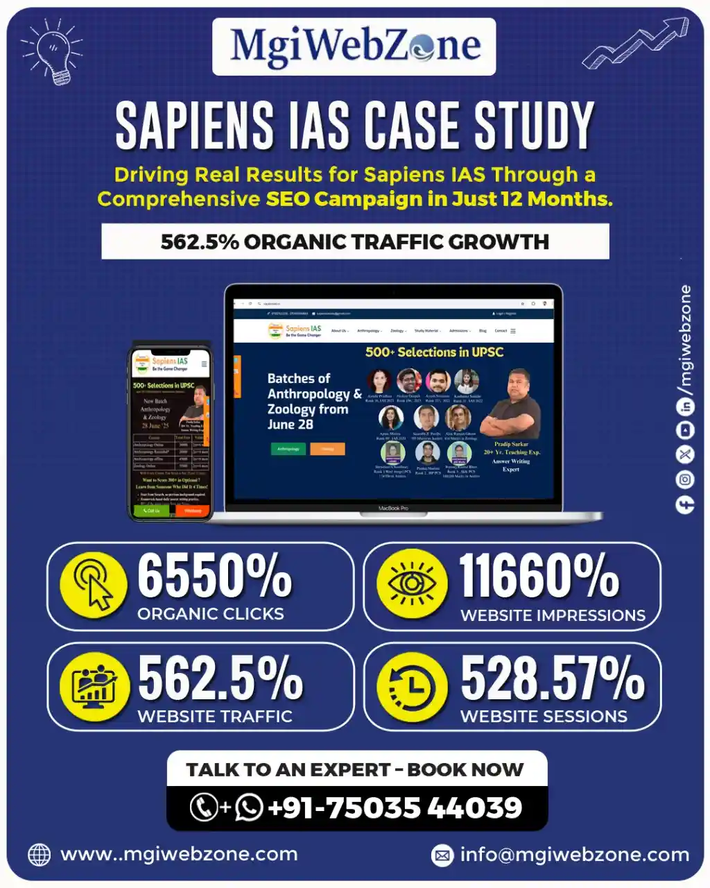
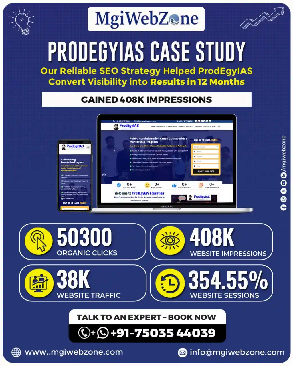
Data-driven Digital Marketing Results for UPSC/IAS Coaching Institutes
Getting Found — SEO, AI Search, and Visibility
Best Website Design Strategies for Coaching Institutes to Rank on Google and AI
Your website cannot convert students who never find it. So before everything else — before the colour palette, before the faculty photos, before the enquiry form — your website needs to be built in a way that Google can understand and rank.
Most coaching websites are built to look good. A high-converting coaching website is built to rank first, look good second. And here is the good news: a properly built website can do both at the same time.
Think of Google as a very meticulous librarian. If your book has a clear title, well-organised chapters, a proper index, and relevant references — the librarian can find it quickly and recommend it when someone asks.
If your website has no clear heading structure, vague course descriptions, and no logical internal links between pages — the librarian cannot categorise it. So it never gets recommended.
SEO-friendly website design means: every course has its own dedicated page, every page has a clear heading that includes what the course is and who it is for, the URL structure is simple and descriptive (yourcoaching.com/ca-foundation-coaching not yourcoaching.com/page?id=47), and pages are connected to each other through internal links.
This is not technical complexity. This is organisation. And coaching institutes that have this organised structure rank higher and get more organic visitors than those that do not — without spending a single rupee more on ads.
How to Build an SEO-Friendly Website for a Coaching Institute in India
1) Step one is the domain. Choose a domain name that includes either your institute name or your subject keyword. yourcoachingname.com is always better than something clever that nobody remembers.
2) Step two is the site architecture. Every coaching institute website needs these pages, minimum: Homepage, About Us, one dedicated page per course or subject, a Faculty page, a Results page, a Blog section, and a Contact page. These are not optional pages. Each one does a specific job.
3) Step three is the URL structure. Keep it clean. /upsc-coaching/ not /upsc-civil-services-exam-coaching-classes-in-delhi-india/. Google likes clean. Students like clean.
4) Step four is the content structure within each page. Every page should have one H1 heading that clearly states what the page is about. Under it, three to five H2 headings that break the page into logical sections. Under each H2, clear answers in plain language.
5) Step five is internal linking. Every course page should link to the faculty page. The faculty page should link to the results page. The results page should link to relevant course pages. This creates a web of connections that tells Google your website is a complete, authoritative resource — not a collection of disconnected pages.
How to Appear on Google AI Overviews with Your Coaching Website
This is the most important visibility shift happening in 2026 — and almost no coaching institute in India has adapted to it yet. That is a significant opportunity.
When a student types “best CA coaching in Mumbai for working professionals” into Google, a box appears at the very top of the results page — before any links.
It is called a Google AI Overview. It gives a direct, summarised answer in two to three sentences. It may name one or two coaching institutes specifically. If yours is named there — you get trust and recognition even before the student clicks anything. If yours is not named — they may not scroll further.
And here is the important part: Google AI Overviews are not controlled by who spends more on ads. They are controlled by who has the clearest, most structured, most authoritative content. The institutes that appear in AI Overviews are not always the biggest. They are the best organised.
To appear in AI Overviews, your website needs three things.
- First, content written in question-and-answer format. If a student asks “Is UPSC Anthropology optional good for science graduates?” — your website should have a page that answers exactly that question, in the first paragraph, directly. Not after three paragraphs of introduction. Directly.
- Second, structured data — also called schema markup. This is code added behind the scenes that tells Google what type of content is on each page. FAQPage schema for your FAQ section. Course schema for your course pages. LocalBusiness schema for your location details. A good web developer can add this in an afternoon. The impact on visibility can last years.
- Third, consistent updates. AI Overview sources are regularly updated pages, not stale ones. A coaching website that publishes a blog post or updates its course page once a quarter is more likely to appear than one last updated two years ago.
There is also a concept called “zero-click visibility” that coaching owners rarely know about. When Google’s AI Overview answers a student’s question in the snippet — they may not click at all.
But, if your institute is named in that snippet, you still gain brand recognition. The student who later searches specifically for your institute name was influenced by that zero-click moment. Being named matters, even without a click.
[Read our guide on AI Search and AEO for UPSC Coaching Institutes]
City-Specific Landing Pages for Coaching Institutes — Why One Page Cannot Do Everything
One of the most common mistakes coaching institutes make online is this: they have a single homepage that tries to rank for enquiries from every city they serve.
Here is why that does not work. Google’s algorithm for location-based searches is very specific. A page that says “UPSC coaching in Delhi” cannot simultaneously rank for “UPSC coaching in Jaipur” — even if you run batches in both cities. These are two different search intents. Two different audiences. Two different ranking opportunities.
The solution is a separate, dedicated landing page for each city you serve. Not a copy-paste page with just the city name changed. A genuinely useful page for students in that specific city — mentioning batch schedules for that location, nearby landmarks, metro access, hostel options in the area if relevant, and testimonials from students in that city.
Think of it this way: a city-specific landing page is the digital equivalent of putting a signboard outside your Jaipur centre. Without it, Google does not know you are relevant to Jaipur searches — even if you have been teaching Jaipur students for three years.
For large coaching institutes with centres in multiple states, this becomes a significant content project. But even adding two or three city-specific pages for your highest-priority locations will produce a noticeable improvement in local search visibility within three to four months.
Why Your Coaching Institute Website Needs a Blog Section
Each blog post you publish is a new door into your website. Think about that for a moment.
Your homepage is one door. Your course pages are a few more. But a student searching for “Is Maths optional good for a working professional doing UPSC?” will not land on your homepage through that query. They will only find you if you have a blog post that answers exactly that question.
Every genuine question a student asks before joining your coaching — and there are dozens of them — is a search query that someone is typing into Google right now. Each question you answer in a blog post is another door through which a student can find you. And this student is not a cold lead. They are in active research mode. They are close to making a decision.
In our experience, coaching institutes that consistently publish blog posts — one every two weeks is enough to start — see organic traffic grow by 60 to 80% within the first year, without increasing their ad spend. The blog does not cost per click. It just compounds.
And here is the trust dimension that most coaching owners miss: a student who reads three of your blog posts before calling you is not a cold enquiry. They have spent twenty minutes with your content. They already feel like they know how you think. That student converts at a significantly higher rate than someone who found you through a paid ad. Every blog post is a trust deposit.
[Read our guide on content marketing and blog strategy for coaching institutes]
How a Well-Designed FAQ Page Ranks on Google and Generates Enquiries
A FAQ page is not a “nice to have.” For a coaching institute, it is a conversion page disguised as an information page.
- Here is why it matters for SEO: Google’s People Also Ask boxes and AI Overviews are fed almost entirely by FAQ-style content. If your website has a FAQ section where each question is written as an H3 heading and answered in fifty to seventy words directly below it — your content is formatted exactly the way AI tools prefer to pick it up and display it.
- Here is why it matters for conversion: every question in your FAQ section is a hesitation a student had before enquiring. “What is the fee?” “How many tests are included?” “Is online batch available?” “What if I miss a class?” When your FAQ page answers these questions, it removes the reasons not to call. The student who has already read your FAQ is a much warmer lead than one who has not.
A FAQ page of twenty well-written questions can rank for twenty different long-tail search queries simultaneously. That is twenty additional entry points into your website, each one capturing a student in research mode.
Find Out How Many Students Are Already Searching for Your Coaching Institute
Get a free visibility check. No commitment. Just clarity.
The Architecture of a High-Converting Education Website
Best Website Structure for Coaching Institutes — Homepage to Conversion
A coaching website is not a brochure. It is a system. Every page has a specific job. And when every page does its job — the visitor moves, naturally and without friction, from landing on your site to contacting you.
Here is the structure that works, page by page.
- The homepage: Its job is to establish who you are, what you offer, who it is for, and what the student should do next. In that order. Nothing else should be on the homepage above the fold. No admission season dates. No faculty events. No newsletter signup. Just: who we are, what we teach, why you should trust us, and how to take the next step.
- The About page: This is consistently the second most visited page on any coaching institute website. Its job is to answer the question: “Is this institute right for me and can I trust them?” Faculty founders should be front and centre. The story of why this institute exists — genuinely told — converts better than any marketing claim.
- Course pages: One page per course. Not one page with all courses listed. Each course page does one job: make a student who is interested in that specific course confident enough to enquire. Include: what the course covers, who teaches it, what it costs, when batches start, what results previous students achieved, and a clear CTA.
- The results page: Proof. Specific, verifiable proof. Not “hundreds of our students have succeeded.” Actual AIR numbers, year, optional subject for UPSC. Actual pass percentages for CA. Actual placement records for computer training. This page is where trust is confirmed.
- The blog section: The long-term visibility engine. Every post is a new entry point for a new type of student.
- The contact page: Its only job is to make contacting you effortless. One click to WhatsApp. One click to call. A simple three-field form. A Google Maps embed. Operating hours. Nothing complicated.
Think of this structure as a guided conversation. The student arrives on the homepage, gets oriented, goes to the course page that interests them, confirms on the results page, and then contacts you. Each page hands them to the next. No dead ends. No confusion.
Landing Page Design for Coaching Institutes — What Actually Works
A landing page is different from a course page. Understanding this distinction will save you significant ad budget.
A course page is built for SEO and general browsing. It provides comprehensive information for a student who arrived organically and is in research mode.
A landing page is built for a specific campaign. A student arrives from a Google Ad or a Facebook post. They are in a specific frame of mind — they clicked because of one specific promise. The landing page’s only job is to fulfil that exact promise and get them to enquire.
No navigation menu pulling them to other pages. No links to your blog. No social media buttons. Just: the promise they clicked for, the proof it is real, and one way to act on it.
Here is the anatomy of a landing page that converts for coaching institutes. Above the fold: a headline that states exactly what the student gets (“UPSC Public Administration Optional Coaching — Batch Starting April 2026”). Below it: one line of social proof (“47 students from this batch cleared Mains in CSE 2025”). Then: a simple form or WhatsApp button. That is everything above the fold. Everything.
Below the fold: three to four key benefits in plain language, faculty photo and credential, one student testimonial with a name and result, fee range or “limited seats” signal, and a second CTA.
The biggest mistake coaching institutes make with landing pages: they put everything on them. Course history, faculty biography, institute awards, testimonials from five years ago, FAQs. The landing page becomes a website within a website. Students get lost. And a lost student does not enquire.
Course Page Design for Coaching Institutes — What Actually Works
Every serious student visiting your course page is asking one question: “Is this course right for me and can I trust this institute to deliver?”
Your course page’s only job is to answer that question, in plain language, in the right order.
1) First: what this course is for. Not a description of the subject. A description of who this course is designed for. “For UPSC aspirants targeting Mains with Public Administration optional, who want structured answer writing practice and subject-specific test series” says more than “Public Administration is a popular UPSC optional subject with a large syllabus.”
2) Second: what is included. Specifics. Not “comprehensive coaching.” How many hours per week? How many tests? Is there recorded access? Is doubt clearing included?
3) Third: faculty credentials. Name, photo, their own exam background if relevant. For UPSC, did the faculty member clear the exam themselves? In which year? With which optional? For CA, what attempt did they clear? For computer training, what is their industry experience?
4) Fourth: past results. Specific. Verifiable. Recent.
5) Fifth: batch details. Start date, timing, mode (online/offline/hybrid), seats remaining.
6) Sixth: fees. State them. Coaching institutes that hide fees with “call for details” lose a significant portion of students who assume the fee is unaffordable and do not call. Transparency builds trust. Hidden information breaks it.
7) Seventh: one clear CTA. WhatsApp or call. Not a complex multi-step form.
The course page is where most coaching institutes lose students who were already interested. Give them everything they need to say yes — and one easy way to do it.
Demo Class Page Design — What Your Page Needs to Convert Visitors
The demo class page is where hesitation lives. The student is interested but not committed. Something is holding them back. Your demo class page’s only job is to remove that hesitation — quickly.
What must appear on this page: what they will experience in the demo (not a generic description — a specific preview), who will take it, when it is scheduled, how to register in under thirty seconds, and some genuine testimonial from students who joined after their demo class.
That is all. Nothing else on this page belongs there. No institute history. No awards. No unrelated links.
The most effective demo class pages are also the shortest. A student who has to read 800 words to register for a demo class does not register. A student who finds a page that says “Register for a free demo class — Thursday 6pm — 45 minutes with [Faculty Name] on [Topic]” and has a single WhatsApp button below it — registers immediately.
Test Series and Exam Preparation Package Page Design
Test series pages serve a very specific student: one who is already preparing, already knows your institute, and is now deciding whether to buy your test series specifically.
This student has different questions than a student exploring coaching for the first time. They want to know: how many tests, how frequently, how closely do the questions mirror the actual exam pattern, how is evaluation done, who evaluates answers (faculty or AI), when do they get feedback, what does a sample paper look like, and what is the price.
The test series page that does not answer all of these — with specifics — loses the sale to a competitor who does.
- For UPSC coaching: emphasise the Mains answer writing evaluation process.
- For NEET: emphasise the difficulty level calibration and the chapter-wise breakdown.
- For CA: emphasise the full-syllabus mock test schedule aligned with the ICAI exam calendar.
Add one sample question or one sample evaluation — visible on the page — and you will see conversion rates on this page improve noticeably.
How to Design Batch Announcement Pages That Fill Seats Faster
A batch announcement page is not an information board. It is a decision deadline.
Here is the difference. An information board says: “New batch starting soon for CA Intermediate Group 2. Register your interest.” A decision page says: “CA Intermediate Group 2 — Batch Starting April 15. 12 Seats Remaining. Fee: ₹18,000. Faculty: [Name]. Register by April 10 to confirm your seat.”
Which one creates urgency? Which one answers every question a student needs to decide? Which one makes the next step obvious?
The urgency is not manufactured. If your batch genuinely has a limited number of seats — say so. If it genuinely starts on a specific date — say so. Real information creates real urgency. False urgency (“Only 2 seats left!” when there are forty) destroys the trust you worked hard to build.
About Us Page — What Should Be Included
The About page is almost always the second most visited page on any coaching institute website. Students go there after the course page — to verify the humans behind the teaching.
Most coaching institutes use this page to list awards, years of operation, and number of students taught. These are not wrong. But they are not what makes a student trust you.
What makes a student trust you on the About page is the story. Why did this institute start? What problem was the founder trying to solve? What do they genuinely believe about how this subject should be taught?
A UPSC coaching institute that says “We started in 2011 because our founder believed that Geography optional was being taught as rote memorisation rather than conceptual understanding — and that belief has shaped every class we teach since then” — that sentence creates more trust than any award or statistic.
Your About page should include: the founding story (genuine, specific, not corporate-sounding), the director’s background and what makes them credible, a brief statement of the institute’s teaching philosophy, and key proof points (years, selections, student count).
The About page is also where you answer the question no student asks out loud but every student is thinking: “Is this institute right for someone like me?” Answer that directly. “Our coaching is best suited for aspirants who can commit to three hours of daily preparation and are targeting their second or third attempt” tells the right student they have found the right place — and tells the wrong student before they waste their time and yours.
Why Your Institute’s Origin Story Matters on Your Website
Every established institute once started with twelve students in a single room. What built their credibility in those early days was not results — it was the founder’s conviction about why they were doing this.
That story does not disappear when the institute grows. It becomes more powerful. Because it is the reason everything else exists.
Across every exam category, the best-converting About pages share one thing: they tell you why this specific person decided to start this specific institute. A CA who saw his own batchmates fail repeatedly because of poor revision strategy — and started coaching specifically to fix that. A GATE Electronics topper from a Tier 2 city who built coaching for aspirants who could not afford to relocate to Delhi. These are not marketing lines. They are reasons to trust.
If your About page does not have a genuine story — not a corporate summary, but an actual story — it is leaving significant trust on the table.
Your Coaching Niche Has a Market. Let's Make Sure Students Can Find You.
MgiWebzone builds AI-ready SEO strategies specifically for UPSC coaching institutes.
Converting Visitors into Enquiries
How to Turn Your Coaching Website into a Lead Generation Machine
Traffic that does not enquire is wasted traffic. Full stop.
Most coaching owners celebrate when their website traffic goes up. And traffic is good — but it is the beginning of the journey, not the end. The website’s job is not to attract visitors. Its job is to convert visitors into enquiries. Everything else is just the path to get there.
The conversion journey has four stages: discovery (they find you), trust (they believe you), decision (they choose you), and action (they contact you). Your website must support all four stages — in sequence. Most coaching websites support the first two reasonably well. They collapse at the third and fourth.
And here is what most edtech marketing agencies will not tell you: the gap between getting traffic and getting enquiries is almost never a traffic problem. It is almost always a page problem. Something on the page is preventing the student from taking the next step. Finding that something — and fixing it — is what turns a website from a brochure into a lead generation machine.
Coaching Website Features That Turn Visitors into Enquiries
Let us be specific. These are the features that directly affect enquiry volume — not design elements, but functional elements that change behaviour.
1) A sticky WhatsApp button on mobile. This is the single highest-impact addition any coaching website can make. It means that at any point in the student’s visit — however deep they scroll — one tap connects them to you. Without it, a student who wants to contact you has to scroll back up, find the contact page, and navigate to your number. Some do. Many do not.
2) An inline CTA within course descriptions. Not just at the top and bottom of the page. Midway through the course description — after you have described what is included and before you list the fee — add a line: “Want to discuss if this batch is right for you? WhatsApp us directly.” At that exact moment, the student is engaged. Do not make them finish reading before they can act.
3) A callback request option. Some students do not want to initiate contact. They want you to call them. A simple “Request a Callback” form — name and phone number only — captures these students. Otherwise they leave without enquiring.
4) Exit-intent signals. A student who has read your course page for two minutes and is about to leave is a warm lead. A well-placed message at that moment — “Still deciding? See how our last batch performed.” with a results page link — can bring them back.
Where to Place CTA Buttons for Maximum Enquiries
CTA placement is not a design decision. It is a behavioural decision.
Think of it like road signs on a highway. You do not put the “take exit here” sign after the exit has already passed. You put it at the exact moment when the driver still has time to act. On a webpage, the CTA must appear at every point where the student might be ready to act — not just at the bottom after they have finished reading.
The five places every coaching website must have a CTA: at the top of the homepage (above the fold, visible without scrolling), at the end of every course description, immediately after the results or testimonials section, within the blog sidebar or mid-post, and on the contact page itself (obviously — but many institute websites make even this unnecessarily complicated).
The most overlooked placement: after the faculty section. A student who has just read about the director’s credentials and teaching philosophy is at peak trust. That is the moment to say “Book a direct call with [Faculty Name].” Most websites miss this window entirely.
Best Enquiry Form Design for Coaching Institutes
Short forms win. Every time.
A student who visits your website at 10pm, on their phone, after a day of work or study — they are not going to fill a fifteen-field form asking for their educational background, preferred batch timing, city of residence, how they heard about you, and other details you want but they do not want to give.
At first contact, you need four fields: name, phone number, and course of interest. That is all. Once they have submitted and you have called them — you can gather every other detail you need in the conversation.
The goal of the first enquiry form is not to gather data. It is to start a conversation. Keep it short enough that filling it feels easier than leaving.
One more thing: the submit button. “Submit” is the most unconvincing CTA text possible. Use: “Request Callback,” “WhatsApp Us,” “Talk to Us,” or “Book a Free Consultation.” The student needs to know what happens after they click. “Submit” tells them nothing.
How Trust Signals Increase Conversion Rates on Coaching Websites
A trust signal is any element on your website that makes a student more confident without you having to say a word about yourself.
But here is what most coaching institutes get wrong: trust signals are not universal. They are segment-specific. Using the wrong trust signal — or using generic ones that apply to any business — converts nobody.
- For UPSC coaching: AIR mentions with year, optional subject, and student name (with permission) are the strongest trust signals. “AIR 23, CSE 2024, Public Administration Optional” communicates more than any paragraph about your faculty’s expertise.
- For CA coaching: attempt-wise pass percentage from the last four attempts, compared to the national average. “Our CA Foundation students have a 67% first-attempt pass rate against the national average of 28%” is a specific, verifiable, compelling trust signal.
- For computer training centres: hiring company logos with job roles and package ranges achieved by alumni. “Last batch: 8 students placed at TCS, Wipro, and Infosys. Average package: ₹4.2 LPA.” That converts.
- For CBSE and Class 10–12 tuition: board result history with toppers from recent years and percentage improvement statistics. “12 students scored above 90% in Class 12 Science boards from our 2024 batch” is trustworthy. “Many of our students score well in boards” is not.
- For any coaching institute: Google review count and rating, prominently displayed. Not a screenshot — a live widget. A student can verify a live widget. They cannot verify a screenshot.
Why Your Website Gets Traffic But Not Enquiries — And How to Find the Exact Problem
This is the most frustrating situation a coaching owner can face. The website is getting visitors. The phone is not ringing. And the usual agency response is another SEO report with more graphs.
The real diagnostic is simpler. Open your website on your mobile phone right now. Not on a desktop. On the phone you use every day. And try to do five things.
- One: can you tell within five seconds what this institute teaches and who it is for?
- Two: can you find a faculty name and credential without clicking more than once?
- Three: can you see a WhatsApp button or call button without scrolling?
- Four: can you find a course page that tells you the fee without calling?
- Five: can you submit an enquiry in under thirty seconds?
If any one of these five fails — that is where your enquiries are leaking. Not in the SEO report. Right there on that page, in that moment, on that device.
The most common causes of the traffic-without-enquiries problem: the website is ranking for informational keywords (“how to prepare for UPSC”) but not for commercial keywords (“UPSC philosophy optional coaching in Delhi”).
Visitors arrive to read, not to enquire. The CTA is only at the bottom of long pages. The mobile experience is broken or slow. The course page hides fees or says “call for details.” The trust signals are generic rather than specific.
Fix any two of these and you will see enquiry volume change within thirty days.
Discover How Our Expert Solutions Can Elevate Your Online Presence
- Boost Online Visibility Fast
- Get More Quality Leads
- Rank Higher on Google
Building Trust Through Website Design
What Makes a Trustworthy Coaching Institute Website in 2026
Trust is not built by claiming to be trustworthy. That sounds obvious — but read the homepage of almost any coaching institute in India and count how many times words like “best,” “leading,” “trusted,” and “experienced” appear. Zero of those words build trust. Every student has seen them on every competitor’s website.
Trust is built by showing the specific things that prove you are trustworthy. There are five layers.
1) Layer one: faculty authority. Not a title — a credential. Not “highly experienced faculty” — “Mr [Name], cleared UPSC CSE 2018 with AIR 47, has taught Public Administration optional for seven years.” One sentence. Specific. Verifiable.
2) Layer two: result proof. Numbers, years, names. Not “many of our students have succeeded.” Exactly how many, in which year, with which result.
3) Layer three: content clarity. A website that explains its courses in plain language — what is included, what is not, who it is for — communicates that the institute has nothing to hide. Vague descriptions create anxiety. Specific descriptions create confidence.
4) Layer four: design professionalism. A clean, fast, well-organised website communicates that the institute is organised, serious, and attentive to detail. An outdated, cluttered, slow website communicates the opposite — before a student reads a single word.
5) Layer five: easy contact. An institute that is easy to reach feels trustworthy. One that buries its contact information, disables direct WhatsApp, and requires filling a long form to get a callback feels like it has something to hide.
How Website Design Builds Credibility for Coaching Institutes
Here is an uncomfortable truth that most coaching owners are aware of but do not want to acknowledge: two institutes with equal faculty, equal results, and equal fees — the one with the better website gets more enquiries. Every time.
Design communicates before content does. In the five seconds before a student reads anything, they have already formed an impression. That impression is based entirely on how the website looks, feels, and loads.
If it looks like 2015, slow on mobile, and difficult to navigate — the student has already mentally filed it under “probably not that good.” If it is clean, fast, and organised — the student is already in a receptive mindset by the time they read your first sentence.
This is not about spending lakhs on design. A clean, well-organised website on a standard WordPress custom design, with proper images, clear headings, and fast loading speed — built with care — will outperform an expensive website that is cluttered and slow. Every time. Because credibility is not about how much you spent. It is about how clearly you communicate.
Faculty Profiles, Results and Testimonials — What to Include and Where
Faculty profiles are the most underused trust asset on coaching institute websites.
What a faculty profile page should contain: a professional photograph (not a stock photo, not a passport-style photo against a white background — a real, warm, credible photo of the person in a teaching context), full name, highest academic qualification, whether they cleared the relevant exam themselves (and when and with what result), how many years they have been teaching this subject, what their teaching philosophy is in two sentences, and a link to a sample class or lecture if available.
This is not an ego page. It is a trust page. The student is evaluating whether this specific person can take them from where they are to where they need to be. Every element of the faculty profile either supports or undermines that belief.
Results pages are only convincing when they are specific. “AIR 7, CSE 2023, Sociology Optional, Ms [Name]” is convincing. “Our student topped the exam” is not. Specific results with verifiable details build trust. Vague claims build nothing.
For testimonials: video testimonials beat text testimonials every time. A slightly imperfect, genuine sixty-second video of a student talking about their experience at your institute builds more trust than ten polished text quotes. Because it is real.
And students — who are smart, sceptical people making a significant financial and life decision — can tell the difference.
How to Showcase Academic Results Effectively on Your Website
Results that convert are results that are specific, recent, and verifiable.
1) For UPSC coaching: AIR number, year, exam name (CSE), optional subject, student name or initials (with permission). Organise by year. Show the most recent years first.
2) For NEET and JEE coaching: rank achieved, year, college or IIT/NIT placement, subject stream.
3) For CA and CS coaching: attempt-wise pass percentages from the last six exam cycles, compared to the national average where available. This is the strongest trust signal in the CA coaching market and almost no institute uses it effectively.
4) For computer training centres: hiring company name, job role, CTC range, batch year. Many students will know the companies named — and that recognition translates directly into trust.
5) For CBSE and Class 10–12 tuition: board exam percentage scores of toppers from the institute, year-wise, with subject breakdown.
One thing to avoid: results pages with only photographs of students holding certificates, with no numbers. These create suspicion rather than trust. The student wonders: why are they showing photos but not numbers?
Tired of paying for ad traffic that never enquires?
MgiWebzone builds UPSC-specific campaigns targeting aspirants by subject, city, and exam preparation stage.
Niche-Specific Website Design Strategies
Website design principles are the same across every education segment. What changes is what trust looks like, what results look like, and what the student’s decision journey looks like. This chapter is a navigation guide — find the section that matches your segment.
Website Design for UPSC and IAS Coaching Institutes
UPSC coaching websites have one unique requirement that no other education segment shares: the optional subject structure.
A UPSC coaching institute that offers five optional subjects needs five separate course pages — one page per optional. Not one “Optionals” page with all subjects listed together.
A student searching for “Sociology optional coaching” will not trust a page that also has Geography, Anthropology, and PSIR mixed in. They want to know that you specifically understand their optional subject. A dedicated page communicates that specificity.
- Each optional subject page needs: subject-specific topper data, faculty credentials relevant to that subject specifically, a section on the syllabus coverage approach, test series details for that optional, and a separate WhatsApp button that ideally routes to the faculty who teaches that subject.
- UPSC websites also need a clear stage-by-stage structure: Prelims coaching, Mains coaching, Optional coaching, Test series, and Interview guidance are five different services that appeal to students at five different points in their preparation journey. Each needs its own page and its own keyword strategy.
[Read our Complete Guide to Website Design for UPSC Coaching Institutes]
Website Design for NEET, JEE and Engineering Entrance Coaching
NEET and JEE coaching websites are evaluated by a combination of the student and the parent — often simultaneously. This dual-audience structure changes how the website should be written.
- The student wants: rank achieved by previous students, college placements, subject-wise faculty credentials, batch structure, and test series quality.
- The parent wants: fee structure, safety and supervision details for residential programmes, batch size and individual attention policy, communication channels for progress updates, and the institute’s record over the last three to five years.
Most NEET and JEE coaching websites serve one audience or the other. The best-converting ones serve both — with the student-facing content on the course page and the parent-facing content on the About page and FAQ section.
[Read our Complete Guide to Website Design for NEET and JEE Coaching Institutes]
Website Design for CA, CS and Professional Exam Coaching
CA and CS coaching websites have one trust factor that is unique to their segment: the pass percentage compared to the national average.
ICAI publishes national pass percentages for every CA Foundation and Intermediate exam. If your coaching institute’s students pass at a higher rate than the national average — that is the most powerful single data point you can put on your website. More powerful than any faculty credential or testimonial.
“Our CA Foundation students achieved a 68% first-attempt pass rate in the November 2025 exam. The national average was 31%.” That sentence sells the course. Put it on the homepage, on the course page, and on the results page.
CA coaching also has a significant working-professional student segment. These students cannot attend morning batches. They need evening classes, weekend sessions, or recorded lectures. If your institute offers these — say so explicitly on every relevant page.
Many CA coaching websites bury this information in the FAQ or leave it out entirely. This single omission loses a large segment of high-intent students.
[Read our Complete Guide to Website Design for CA and CS Coaching Institutes]
Website Design for Computer Training Centres and IT Institutes
Computer training centre websites are, perhaps, the most placement-focused of all education segments. The student is not choosing a course. They are choosing a career outcome. Every element of the website should support this fact.
The homepage should lead with placement data. Not “We offer Python, Java, and Full Stack courses.” Lead with: “Last batch: 23 of 27 students placed. Average package: ₹3.8 LPA.” That is what the student cares about.
Hiring company logos are powerful trust signals for this segment — more powerful than any testimonial. Logos of companies like TCS, Infosys, Wipro, Capgemini, or regional IT employers that students recognise create instant credibility. With permission from placed students, include their name, company, role, and package.
The course page for a computer training centre should include: what projects students build during the course (not just what they learn), the tools and software they will be trained on, whether the institute provides placement support, and exactly what “placement support” means in practice (resume review, mock interviews, company connections, or guaranteed placement).
[Read our Complete Guide to Website Design for Computer Training Centres]
Website Design for CBSE and Class 10–12 Tuition Centres
Tuition centre websites have the most local, neighbourhood-level trust dynamics of any education segment. A parent is not choosing a national brand. They are choosing a teacher who will sit with their child two or three evenings a week.
The most important trust element on a tuition centre website is the teacher’s photo and a genuine human description of their approach. Not “highly qualified and experienced faculty.” But “Ms [Name] has been teaching Class 12 Chemistry in Dwarka for eleven years. Her students have consistently scored above 85% in the CBSE board exams. She believes in concept-first teaching and individual doubt clearing every session.”
That paragraph converts local parents. Because it answers the questions they cannot ask a machine: Is this person warm? Are they patient? Will they pay attention to my child specifically?
Local SEO is critical for tuition centres in a way it is not for national exam coaching. A parent searches “Class 10 Maths tuition in Janakpuri” — not “best mathematics tuition India.” Your Google Business Profile, city-specific landing page, and local content are the three elements that determine whether you appear for that search or your competitor does.
[Read our Complete Guide to Website Design for Tuition Centres and CBSE Coaching]
Website Design for a New Coaching Institute — Building Credibility Without a Track Record
And this is where most advice stops short. But many of the owners reading this have just started, or are starting soon. So let us be honest about what a new coaching institute’s website can and cannot do.
You cannot fake results. You should not try. Students are smart. Parents are even more careful. Any claim that looks unverifiable will be distrusted immediately.
But here is what you do have: the founder. The founder’s story. The founder’s credentials. The founder’s conviction about why this institute needed to exist.
A new UPSC coaching institute that leads with “Our founder cleared CSE 2019 with AIR 34 and spent two years realising that most optional coaching in India teaches to the syllabus, not to the Mains paper. This institute exists to fix that” — that is compelling. That is a reason to trust. Even without a single result.
A new CA coaching centre that says “Our director cleared CA Final in two attempts, struggled with the same taxation topics most students fail on, and built this course specifically around those weak areas” — that is specific, credible, and genuine. That converts the right students.
For a new institute, the About page is your most important page. The faculty page is your most important trust signal. And your first five student testimonials — even informal, even short — should go on the website immediately.
Technical Performance — Speed, Mobile, and Modernisation
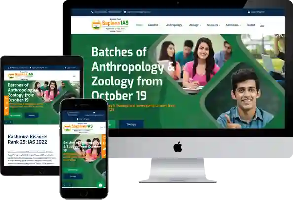
Why Mobile-Friendly Websites Are Non-Negotiable for Coaching Institutes in 2026
More than 78% of students in India search for coaching on their phone. Not a laptop. Not a desktop. A phone, usually with one hand, often on a slow connection, often in the middle of doing something else.
A website that is not mobile-friendly is like a coaching centre that is only open Monday to Friday, 10am to 5pm. Technically open. But most of your potential students cannot access it when they need it.
Mobile-friendly does not just mean “it opens on a phone.” It means: the text is readable without pinching and zooming. The buttons are large enough to tap with a thumb without accidentally clicking the wrong thing. The course page does not require horizontal scrolling. The WhatsApp button is visible without scrolling to the bottom. And the entire page loads in under three seconds on a standard 4G connection.
Test your website on your phone right now. Not in a desktop browser’s “mobile view.” On your actual phone. If you find yourself pinching, zooming, or scrolling sideways — your students are finding the same thing. And they are leaving.
How Fast-Loading Websites Help Coaching Institutes Get More Enquiries
Google’s own data shows that when a mobile page takes more than three seconds to load, more than 53% of visitors leave before it opens. That is more than half your potential enquiries — gone before they see a single word you wrote.
Website speed is not a technical luxury. For a coaching institute with limited ad budget, it is an admission problem.
The most common causes of slow coaching institute websites: images that have not been compressed (a homepage with five high-resolution banner images can be 8 to 10MB — it should be under 500KB). Cheap shared hosting that cannot handle even moderate traffic. Too many unnecessary plugins and scripts. No browser caching configured.
You do not need a developer to check your website speed. Go to Google PageSpeed Insights (pagespeed.web.dev), enter your website URL, and look at the mobile score. A score above 70 is acceptable. A score above 85 is good. A score below 50 means you are losing students to slow loading — right now, today.
How Established Institutes Can Modernise Their Website Without Losing What Works
The most common fear we hear from coaching owners who have been online for several years: “If we redesign the website, will we lose our Google rankings?”
It is a fair concern. A badly executed redesign — one where old URLs are not properly redirected, where page content is removed or consolidated without thought, where the site architecture is completely changed without preserving the signals Google had learned — can indeed set back years of SEO progress.
But a properly planned redesign improves rankings. Because typically, an institute that has been online for five years and has good content but an outdated website is ranking despite the website, not because of it. Fix the website — faster loading, cleaner structure, better mobile experience, updated content — and the rankings improve along with the enquiry rate.
The right sequence for a redesign: audit first (what is currently ranking and why), preserve all existing URL structures (redirect if changed), improve speed and mobile performance first, update content second, improve visual design third. Not the other way around.
MgiWebzone passes all five of these tests
- 12+ years
- 1,000+ education clients
- 98% client satisfaction
- 94% first-page rankings secured
Making the Right Decision
Custom Website Design vs Website Template — What Is Actually Better for Coaching Institutes
Here is an honest answer rather than a sales pitch.
A template website — well chosen, well configured, and properly set up with good content — will serve a coaching institute adequately in the early stages. It is faster to build, lower in cost, and can be effective if the content is strong.
The limitations of templates show up over time: the SEO architecture is generic rather than education-specific, the page structure is not built around the specific conversion journey of a coaching student, and customising it to fix these problems eventually costs more than building correctly from the start would have.
A custom-built coaching website — built specifically for education, with proper course page architecture, AEO-ready content structure, conversion-optimised layout, and proper speed configuration — gives an institute a significant advantage in competitive search environments. And coaching search environments in India are very competitive.
Who should start with a template: a new institute in the first year, with limited budget and no existing digital presence. A template gets you online quickly and allows you to start building content and reviews while you plan a proper website.
Who should invest in a custom build: an institute that has been running for two or more years, has courses to fill, is spending on Google Ads (because a custom landing page converts ad traffic significantly better), and is in a competitive city or segment.
Cheap vs Premium Website — What You Actually Get
A ₹10,000 website typically gives you: a basic design that looks acceptable on desktop, a homepage, an about page, a contact form, and a mobile view that technically exists but is not optimised. No SEO architecture. No conversion elements. No proper speed optimisation. Usually hosted on cheap shared hosting that goes down during peak traffic.
A ₹65,000 to ₹90,000 properly built coaching website gives you: a mobile-first design that converts on the device most students use, dedicated course pages with proper keyword structure, a blog section ready to publish, a results page, a lead-capture system with WhatsApp integration, proper speed optimisation, and SEO foundations built into the architecture.
In our experience, coaching institutes that spend ₹10,000 on a website end up spending ₹30,000 to ₹40,000 fixing it over the next two years. Or they replace it entirely. The cheap website was not cheaper. It was just delayed spending with interest.
The question is not “how much does a website cost?” The question is “what does each rupee invested in the website return in terms of enquiries?” A well-built website at ₹75,000 that generates fifteen additional enquiries per month, converting at even twenty percent, pays for itself in the first month’s admissions.
What Does a Coaching Institute Website Cost in India — Complete Breakdown for 2026
Here is a transparent breakdown of what different website types typically cost and what they include:
A single-page website or basic informational site typically costs between ₹15,000 and ₹30,000. This is appropriate for a new coaching centre with one or two courses, needing an online presence quickly.
A standard multi-page coaching website — with a homepage, about page, four to eight course pages, results page, blog setup, and contact page — typically costs between ₹35,000 and ₹70,000. This is the most common requirement for an established coaching institute with multiple courses.
A fully custom coaching website with proper SEO architecture, conversion-optimised landing pages, AEO-ready content structure, WhatsApp lead funnel, call tracking, and proper speed configuration typically costs between ₹75,000 and ₹1,50,000. This is appropriate for institutes that are investing in digital marketing seriously and need their website to be a genuine lead generation system.
For EdTech platforms with student login portals, test series systems, or online payment integrations — costs start at ₹1,50,000 and scale based on complexity.
What drives the price difference: not the design complexity, but the thinking behind the structure. A website that is built with the student’s decision journey in mind — with every page doing a specific conversion job — costs more in planning time but returns significantly more in enquiries.
Top Website Design Mistakes Coaching Institutes Must Avoid
1) Mistake one: No WhatsApp button visible above the fold on mobile. Students who are ready to enquire right now leave if they cannot find a way to contact you instantly. Consequence: immediate enquiry loss from the highest-intent visitors.
2) Mistake two: Course pages that say “call for fee details.” Every coaching institute that does this believes they are creating a reason to call. In reality, they are creating a reason to leave. Most students assume the fee is high if it is hidden. They contact the competitor who disclosed their fee clearly.
3) Mistake three: A results page with only photographs and no numbers. Photographs create suspicion. Numbers with context — AIR, year, optional subject — create trust. A results page with only photographs looks like it is hiding something.
4) Mistake four: No mobile optimisation. The website looks fine on the owner’s desktop. Nobody checks it on a phone before launching. Three months later, the bounce rate is 75% and nobody knows why.
5) Mistake five: All content on the homepage, nothing on dedicated pages. A homepage that tries to be everything — courses, faculty, results, testimonials, fee structure, batch dates, contact form — communicates nothing clearly. And it cannot rank for specific keywords because it lacks the depth that dedicated pages provide.
6) Mistake six: No blog section. The website has no way to grow its keyword coverage over time. In two years, the institute has not added a single new entry point for organic visitors.
7) Mistake seven: Generic testimonials without attribution. “Great coaching, very helpful faculty” — Anonymous. No student trusts this. Use real names, real results, real context.
Website Redesign for Coaching Institutes — When to Do It and What to Change First
Five signs your website needs a redesign, in order of urgency:
- One: it takes more than three seconds to load on mobile. This is the most urgent technical problem — it is actively costing you visitors right now.
- Two: the bounce rate is above 70%. This means more than seven in ten visitors leave within thirty seconds of arriving. The page is not answering their question fast enough.
- Three: you cannot update course information, add a new batch date, or publish a blog post without calling your developer. A coaching institute’s information changes frequently. If you cannot manage basic updates independently, your website is always out of date.
- Four: your competitor’s website consistently appears above yours for your most important search terms — and you know your results are better than theirs.
- Five: the design looks like it was built before 2020. Not because old design is wrong — but because student trust is partially formed by design signals. An outdated design communicates an outdated institute, regardless of how excellent the teaching is.
What to change first when you do redesign: speed (technical fix, immediate impact), then mobile experience, then course page structure, then homepage clarity. Visual redesign comes after all of these. The order matters enormously.
Is your UPSC coaching institute visible on AI search, voice search, and social media?
MgiWebzone builds complete, 360° digital marketing strategies for education institutes — covering SEO, Ads, Social, Content, and AI visibility.
How MgiWebzone Approaches Website Design for Education Institutes
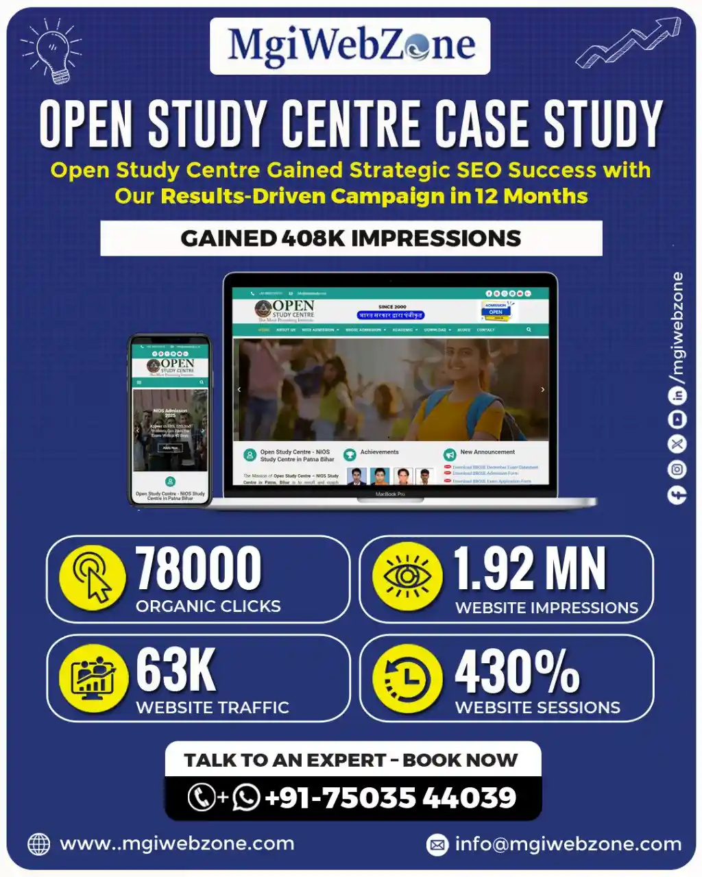
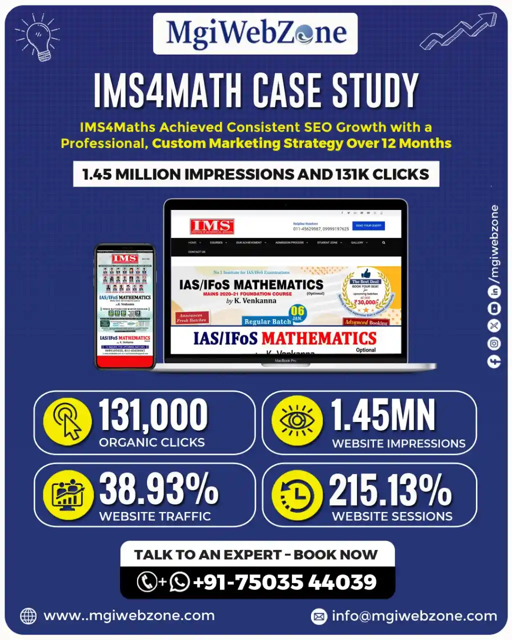
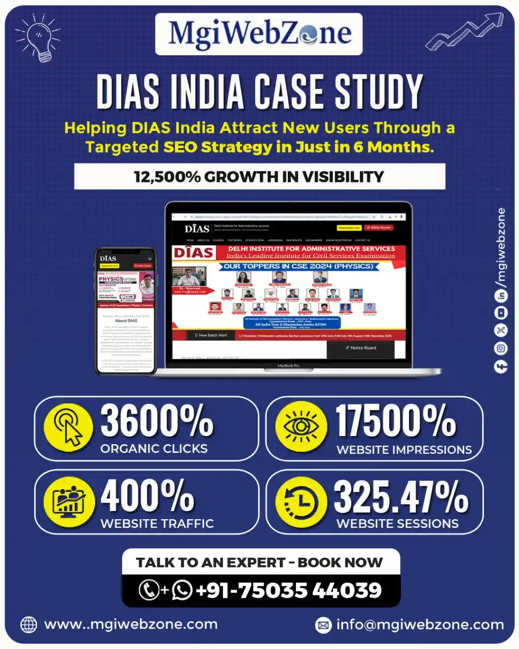
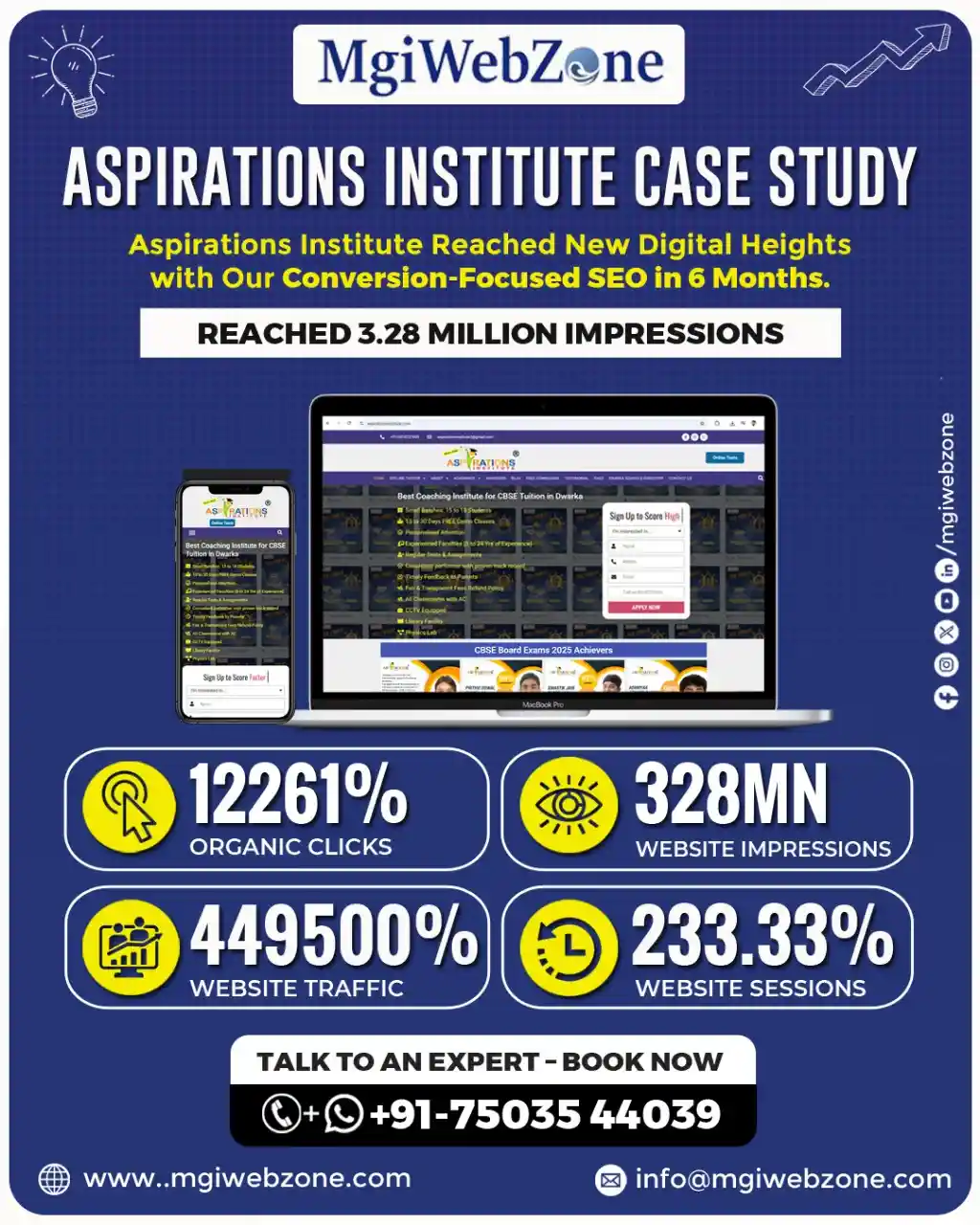
When ProdEgyIAS came to us, the situation was familiar. Strong faculty. Serious teaching on Public Administration optional. Good reputation in the coaching community. And a digital presence that was not reflecting any of that strength.
The website was slow, hard to navigate on mobile, and the course pages did not answer the questions that UPSC aspirants were actually asking. Enquiries came in — but inconsistently. Some months were full. Others were quiet. The institute could not predict which it would be.
We rebuilt the entire digital setup. The website was redesigned with a mobile-first structure, dedicated course and test series pages, a proper results section, and a clear enquiry path — WhatsApp button, callback form, and call tracking — so no serious student who reached the site could leave without an easy way to connect.
We added AEO-ready content that matched how UPSC aspirants actually search in 2026: full questions, voice-style queries, comparison searches. We built authority through structured backlinks and proper technical SEO.
We unified the branding across the website, Google Business Profile, and YouTube so that everywhere a student encountered ProdEgyIAS, it felt like the same confident, organised institute.
Within twelve months: 408,000 organic impressions, 50,300 clicks, and 330 confirmed admissions. A 450% increase in enquiries. Not from a bigger ad budget. From a website that finally did its job.
At MgiWebzone, we have been working with education institutes for over 12 years. We have built and redesigned websites for UPSC coaching institutes, CBSE tuition centres, CA coaching centres, computer training institutes, schools, and EdTech platforms.
We do not treat a coaching website like a restaurant website or a retail website. We understand the specific trust signals that education students look for, the specific pages they visit before enquiring, and the specific conversion moments where most coaching websites lose students.
Our website design process follows six steps.
1) First: a detailed audit of your current situation — what is working, what is not, and where specifically you are losing enquiries.
2) Second: a page-by-page structure plan, based on your courses, your segment, your primary cities, and your competition.
3) Third: design and development with conversion built into the architecture, not added as an afterthought.
4) Fourth: SEO foundations — proper URL structure, schema markup, page speed, and AEO-ready content framework.
5) Fifth: enquiry path setup — WhatsApp integration, call tracking, form configuration, and callback system.
6) Sixth: post-launch support, with monthly tracking of what is working and clear adjustments based on real data.
What to Look for When Choosing a Website Design Company for Your Coaching Institute
Most coaching owners who have worked with an agency before and been disappointed describe the same experience. The website looked fine at launch. The agency said the SEO was done. Three months later, enquiries had not changed. And when asked why, the agency showed a report full of graphs.
The problem in most of these cases is not that the agency did bad work. It is that they did generic work. They built a website for a business — not for a coaching institute specifically.
They did not understand how UPSC students search. They did not know what “optional subject” means. They did not know that a CA coaching course page needs attempt-wise pass rates, not generic “testimonials.” They could not know — because they had never worked in education before.
When you are evaluating a website design partner for your coaching institute, ask these specific questions.
- Do they have existing clients in the education sector — and can they show you those websites?
- Do they understand what your specific students search for and what they check before enquiring?
- Do they talk about conversion and enquiries — or only about “beautiful design” and “modern aesthetics”?
- Can they explain, in plain language, how they will help your website rank on Google?
- And what happens after launch — is there ongoing support, or do they hand over the files and disappear?
The right partner is one who treats your website as a student acquisition system — not a creative project.
Frequently Asked Questions about Website Design for Coaching Institutes and Education Institutes in India
How much does a coaching institute website cost in India in 2026?
A basic single-page coaching website costs between ₹15,000 and ₹30,000. A full multi-page website with dedicated course pages, a results section, blog setup, and contact system costs between ₹35,000 and ₹70,000. A custom-built website with SEO architecture, AEO-ready content structure, WhatsApp lead funnel, and conversion optimisation costs between ₹75,000 and ₹1,50,000. EdTech platforms with student portals or test series systems cost more depending on complexity. Price alone does not determine ROI — the structure and purpose behind the design does.
What is the difference between a landing page and a course page for a coaching institute?
A course page is built for SEO and organic browsing. It provides comprehensive information for a student who arrived through a Google search and is in research mode. A landing page is built for a specific paid campaign. It has no navigation menu, no external links, and one single conversion goal. Mixing the two produces a page that does neither job effectively. Coaching institutes running Google Ads need dedicated landing pages — not their regular course pages — to convert paid traffic efficiently.
How long does it take to build a coaching institute website?
A basic coaching website can be built and launched in two to three weeks. A full multi-page website with proper course pages, SEO setup, and enquiry systems typically takes four to five weeks. A custom-built website with conversion optimisation, AEO architecture, and technical SEO foundations takes six to ten weeks. The timeline depends more on content readiness — how quickly the institute provides course information, faculty details, and result data — than on the development itself.
Can a new coaching institute build credibility online without results yet?
Yes. The founder’s story and credentials are the most powerful trust signals available to a new institute. A clear, genuine explanation of why the institute was started, what the founder’s own exam background is, what they believe about how the subject should be taught, and what makes their approach different — this converts early students before any toppers or pass percentages exist. Transparency about being new, combined with specific founding credentials, builds more trust than vague credibility claims.
What pages must every coaching institute website have?
At minimum: a homepage (clear value proposition and primary CTA), one dedicated page per course or subject (not a single merged “Courses” page), a faculty page (with photos and credentials), a results page (specific, verifiable data), an About page (genuine founding story and institute philosophy), a blog section (long-term SEO and trust engine), a FAQ page (objection removal and AEO rankings), and a contact page (one-click WhatsApp, call number, simple form, and Google Maps embed).
How do I know if my coaching institute website needs a redesign?
Five clear signs: loading time on mobile exceeds three seconds, bounce rate is above 70%, you cannot update course information without calling a developer, your competitor consistently ranks above you for your key search terms, and the design looks significantly older than 2020. If any two of these are true, a redesign is overdue. If all five are true, enquiries are actively being lost every day the website remains unchanged.
Is a custom website better than a WordPress template for a coaching institute?
For a new institute with one or two courses and a limited budget — a well-configured WordPress template is a reasonable starting point. For an established institute with multiple courses, a competitive city or subject, ongoing digital marketing spend, and enquiry targets to meet — a custom-built website with education-specific architecture will significantly outperform any template within six to twelve months. The template’s limitations become apparent as soon as you try to add the conversion elements, course-specific keyword pages, and AEO content structure that a coaching website needs to compete seriously.
How do I make my coaching website appear on Google AI Overviews?
Write content in direct question-and-answer format. Use question phrases as H2 and H3 headings. Answer the question directly in the first sentence under the heading — not after three paragraphs of context. Add FAQPage schema markup to your FAQ section and Course schema to your course pages. Keep content updated — AI Overviews prefer recently updated sources. Build E-E-A-T signals: faculty credentials, verifiable results, years of operation, and external mentions. And publish a consistent blog that answers the real questions your students ask.
What is the right enquiry form for a coaching website?
Three fields at first contact: name, phone number, and course of interest. Nothing else. The goal of the first form is to start a conversation — not to collect a database. A longer form decreases submissions significantly. The submit button should say “Request Callback,” “Talk to Us,” or “Book a Free Consultation” — not “Submit.” And every form should have a visible response-time expectation beneath it: “We call back within 2 hours during working hours.” That small addition increases form submissions measurably.
How many CTA buttons should a coaching website have?
Every page should have at minimum two CTAs: one above the fold and one at the end of the page content. Course pages should have a third CTA immediately after the results or testimonials section. Blog posts should have a CTA within the post and one in the sidebar. The homepage should have a CTA after each major section. More CTAs do not feel pushy — they feel convenient. Students who are ready to enquire at different points in their reading should always have an easy way to act without having to scroll back up or navigate to a different page.
What should the About Us page of a coaching institute include?
The founding story — genuine, specific, and told in plain language. The director or founder’s name, photograph, educational background, and why they started this institute specifically. The institute’s teaching philosophy in two to three sentences. Key proof points: year established, approximate number of students taught, notable results. And — this is the most overlooked element — a clear statement of who this institute is best suited for. “Our coaching works best for aspirants targeting their second or third attempt who want structured guidance rather than self-study support” tells the right student they have found the right place.
How do I showcase academic results on my website in a way that students trust?
Results must be specific, recent, and verifiable. For UPSC: AIR number, year, optional subject, student name or initials with permission. For CA: attempt-wise pass percentage from the last four exam cycles, compared to the national ICAI average. For NEET and JEE: rank achieved, college placement, year. For computer training: company, role, CTC range, batch year. Avoid vague claims like “hundreds of students have succeeded.” One specific, verifiable result is worth more than twenty vague ones.
What is the difference between website design for a UPSC coaching institute and a CA coaching institute?
The primary difference is in trust signals and page structure. UPSC coaching websites need subject-specific pages for each optional, topper data with AIR and exam year, and content that matches the question-based search behaviour of UPSC aspirants.
CA coaching websites need attempt-wise pass percentages compared to national averages, explicit mention of batches for working professionals, and content that reflects the structured ICAI exam calendar. Both need speed, mobile optimisation, and clear enquiry paths — but what a student checks before trusting each type of institute is fundamentally different.
How does website speed affect enquiries for a coaching institute?
Directly and significantly. When a mobile page takes more than three seconds to load, more than 53% of visitors leave before the page opens — according to Google’s own research. For a coaching institute receiving 500 visitors per month to a slow website, that means approximately 265 potential students leave before they see anything. Even recovering half of those through a speed improvement could mean 130 additional visitors per month who actually see your content. Speed is not a technical detail. For a coaching institute, it is a direct admission issue.
Data-driven Digital Marketing Results for UPSC/IAS Coaching Institutes
Share this :

MgiWebzone
Passionate about SEO, content, and everything that helps businesses grow online.
Read All Post
Content Marketing for UPSC Coaching — Building Trust Before the Aspirant Even Calls
Popular Categories
How Can We Help?
Discover tailored solutions to grow your business and achieve lasting success.
Our Service
Our Latest Post


January 25, 2026
FOLLOW US ON
Facebook
Twitter
LinkedIn
Pinterest
WhatsApp
Skype
SEO Insights, Tips & Trends from Our Blog
Performance Marketing for Educational Institutes: A Complete Guide to Getting More Admissions in 2026
Scale Educational Admissions Using Performance Marketing Strategies Targeted Student Lead Generation Data-Driven Campaign Optimization High-Converting Ad Creatives Multi-Channel

Lead Generation for Coaching Institutes: Complete Data-Driven Guide (SEO, Ads, AI & Student Enrollment Strategy)
Fill Your Coaching Batches with Predictable Leads Data-driven student acquisition strategy SEO, Ads & AI combined High-intent enquiries,
Indian Education Marketing Statistics Report 2026: SEO, PPC, AI, Lead Generation & ROI Trends
Indian Education Marketing Stats 2026 Every Institute Owner Must Know Real Data on Student Search Behaviour SEO, PPC
UPSC Optional Subject Coaching Market Report 2026: Complete Data on All 25 Subjects, Market Size, Toppers, and Trends
UPSC Optional Coaching Market Report Every Institute Owner Must Read Real Market Size Behind Each Subject 25 Subjects
How Big is the UPSC Coaching Market in India: Official Data, Student Segments, Revenue Estimates, and Growth Trends (2026)
The Complete UPSC Coaching Market Guide for Institute Owners Real Market Numbers Most Owners Miss 6 Student Segments
Best Digital Marketing Agency for UPSC Coaching Institutes in India (2026 Guide)
Before You Hire Any Marketing Agency Read This UPSC Marketing Guide Why General Agencies Waste Your Budget The
Trusted and Affordable Digital Marketing Company in Delhi, India
- Latest Marketing Strategy
- Affordable Service Packages
- Improve User Experience
- Quality & Organic Traffic
- Transparent Progress Report
- Certified Professionals Expertise
Request a Quote
5/5 - (20 votes)


